
N
I
C
C
O

Festive Campaign Design Without Throwing Away the Brand

6
Oct
Festive Campaign Design Without Throwing Away the Brand
A festive campaign is a layer you put on for a few weeks. It is not a new identity. Navratri and Dussehra fall in October 2026, and Diwali follows in early November. By December the marigolds should be gone and the brand should look like itself again.
Owners in Tiruchengode and across Tamil Nadu often ask for a Diwali look in the first week of October. The useful answer is a temporary system: offer lockups, story frames, and a few shop photos. The logo, colours, and type stay. If the festive work needs a new logo, it is not a campaign. It is a rebrand, and a rebrand does not belong in a three-week rush.
A festive layer versus a new identity
A layer adds. It does not replace. Keep the mark, the wordmark, the core colours, and the way you write the business name. Add one festive device you can remove: a diya or marigold motif, a limited gold line, or a badge that says the offer and the end date. When the device is gone, every other piece should still be recognisable.
Test it. Cover the festive badge with your thumb. If the layout no longer looks like your shop, you redesigned the brand. Put the original layout back and place the badge in a corner.
Branding sets those rules once. A festive flight only borrows them. Do not change the font because a template looked festive. Do not introduce a second logo for Diwali only. Two logos in one month teach customers nothing.
Offer lockups that stay on-brand
An offer lockup is the small block that holds the deal: a festive price on silk sarees until the week after Diwali, or free hemming on orders placed this week. It sits on ads, stories, and the shop poster. It is not a new brand line.
- Use the existing type, or one weight heavier. Do not switch to a decorative festival font for the business name.
- State the offer and when it ends. An open-ended special price trains people to wait, then confuses them in December.
- Keep your usual colours as the large areas. Festive gold or maroon can be a rule or a badge, not the whole background.
- One offer per lockup. A second offer gets a second frame, not a smaller line nobody can read on a phone.
Place the lockup in the same corner on every size: square post, story, and banner. Staff in the shop should be able to point at it and say the same sentence the ad says.
Mobile banners and story frames
Most of this flight will be seen on a phone. Design the story frame first, then the feed post, then anything wider. If the offer only works on a desktop banner, it will fail in the auction you are paying for.
A story frame needs a quiet zone for the face or the product, and a fixed strip for the lockup. Do not put type over the eyes or over the jewellery. Leave the platform buttons alone. Meta's safe zone for Stories is why the bottom of a story is not yours.
Export three sizes from one layout, not three different ideas. The same photo, the same lockup, the same corner. Social media marketing then looks like a campaign instead of a folder of unrelated greetings.
Motion is optional. A still frame that is readable in one second beats a spinning diya that hides the price. If you animate, move the motif, not the logo.
Photos from the real shop
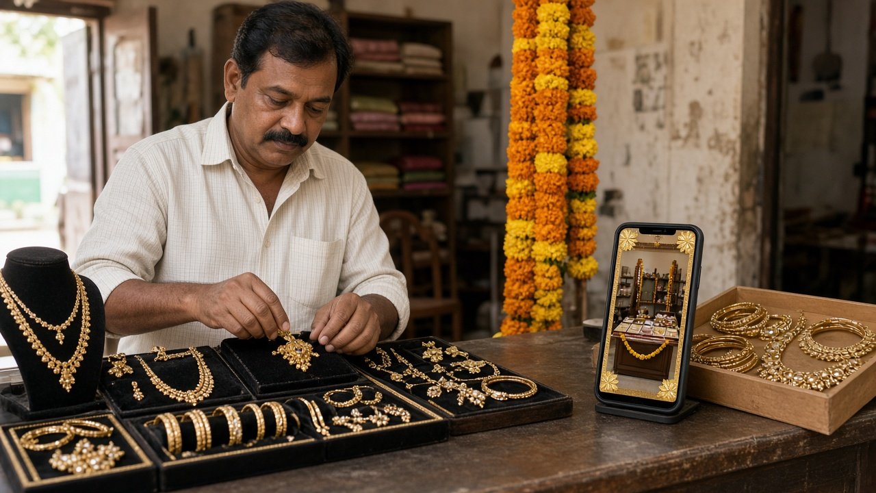
Festive templates full of stock diyas make a Tiruchengode shop look like every other shop in the country. Photograph the real counter, the real staff, and the real product in the light you actually have.
Take the set in one morning. The product on the table, with the offer card in frame. A staff member a customer would recognise. The shopfront, so someone coming from Google or Instagram can find the door. One detail: weave, sweet box, machine, or showroom floor. Specific beats pretty.
You do not need a studio. You need a clean background, daylight, and ten minutes without customers in the frame. Phone photos are enough if the product is sharp and the lockup is added afterwards, not typed onto a blurry picture in WhatsApp.
Avoid festival scenes your shop does not have. A palace backdrop with a logo in the corner is not your brand. The landing page should use the same photographs, so the click and the page feel like one visit. That is ordinary UI/UX discipline applied to a short season.
Tamil and English in the same layout
Many customers read the offer in Tamil and the brand name in English, or the other way around. Plan both languages in the frame from the start. Do not design in English and then shrink Tamil underneath until it is illegible.
Give each language a job. Tamil can carry the offer and the warmth. English can carry the brand name and a short price line, or reverse that if your customers already know the brand in Tamil. Do not translate every word twice. Duplicate sentences make the frame crowded and the offer smaller.
Check the line length. Tamil often needs more width than the English you drafted. If it wraps into four lines, cut the sentence. Do not reduce the type below what a phone can read at arm's length. Ask someone who speaks both to read it aloud once. A fluent sentence matters more than a literal one.
Set the same alignment on every frame so the eye learns where the offer sits. Mixing centred Tamil and left-aligned English on alternate posts looks unfinished.
What to retire once Diwali week is over
Put a removal date on the calendar when you approve the files. The week after Diwali is late enough. Leaving festive frames up through December makes the brand look late, not generous.
- Story highlights named for Navratri or Diwali, unless you move them into a normal Offers highlight with the dates removed.
- Profile banners and website heroes that mention a price that has ended.
- Ad copy and landing sections that still say the festive offer. Pause those ads the same day you change the page.
- Shop posters and WhatsApp status images. Replace them with the ordinary brand frame, not with a blank profile.
Keep the photos of the real shop. They are still true in December. Remove only the lockup and the festive motif. That is the point of a layer: the photograph survives, the season does not.
December should look like your brand on a normal week. If it still looks like Diwali, the layer was never a layer.
Final takeaway
Design the October work so it can come off in November. Same logo, same colours, one offer lockup, real shop photos, and Tamil and English given room in the same frame. Then take the festive pieces down on the date you wrote down.
If you want that layer built without a second identity, contact Nicco Web Solutions. We will set the frames, the photos, and the date they come down.
0 Comments
Leave a Comment


+91 8903020729
Mon - Sun
9.30 am - 7.30pm
457/1-1, Nadar street-10,
Sanarpalayam, Tiruchengode,
Tamil Nadu 637211
Sanarpalayam, Tiruchengode,
Tamil Nadu 637211