
N
I
C
C
O
Brand Identity Essentials for Digital Businesses

15
Mar
Brand Identity Essentials for Digital Businesses
Brand identity is the system people use to recognise you. It is the logo, yes, but also colour, type, photography, tone, and the way a page feels in the first three seconds.
A digital business without identity looks rented. Offers change, posts look unrelated, and the website feels like a different company from Instagram. Branding exists to stop that leak of trust.
Identity is not decoration
Start with positioning. Who is this for, what problem do you solve, and why should they believe you? Visual choices should follow those answers. An industrial supplier and a boutique studio should not share the same template look.
Write three personality words you can actually keep: for example clear, practical, and warm. Then refuse work that fights those words. Identity fails when the brand says premium and the contact form looks abandoned.
The kit every team actually uses
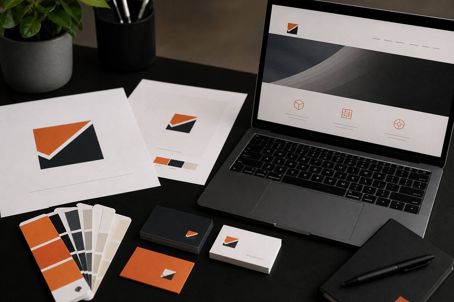
You need a logo that works in colour, in white, and as a small mark. You need two typefaces at most. You need a short colour set with one accent, not a rainbow. You need photo rules so staff snapshots and stock images do not collide.
Put it in a short guide: do, do not, and examples. Designers, marketers, and developers should be able to follow it without a meeting. That is how identity survives after the first launch, and it matches Nielsen Norman Group’s consistency heuristic.
Apply it where customers decide
The website header, proposal PDF, visiting card, Google profile, and Instagram grid should look like relatives. If you are rebuilding the site, brief web development and UI/UX from the same guide so layout and identity move together.
Internal links help here too. A branding article should point to the branding service. A presence article should point to marketing. Search engines treat that as a map of expertise; readers treat it as a helpful next step.
- One primary logo and one simplified mark.
- Colour and type that remain readable on phones.
- Voice notes: how you greet, how you explain price, how you refuse jargon.
- File names and folders so the latest logo is obvious.
Identity versus image
Identity is what you design. Image is what customers repeat after a job. Nielsen Norman Group’s note on UX as brand is useful here: the experience is the brand. If delivery is slow or invoices are confusing, the visual system cannot cover it. Brand work and operations have to match.
Review the image twice a year: search results, reviews, and the first screen of the website. Ask a new customer what they thought you did before the first call. If the answer is vague, the identity is still talking to insiders.
A strong identity is boring in the best way. People stop noticing the logo and start remembering the promise.
Grow without redesigning every year
Leave room for a sub-brand, a campaign, or a new service without throwing the system away. Flexible identity is cheaper than a full redo every time you add app development or a new offer.
Common breaks you can fix this month
Too many fonts, a logo that disappears on a dark header, and a different orange on Instagram and the website are the usual leaks. Pick one accent colour and protect it. If staff design posts on phones, give them templates with locked colours.
Stationery, quotations, and invoices are part of identity. A professional site with a messy PDF still feels unfinished. Align those templates when you refresh the mark.
Name the brand the way you want to be searched. If customers already say Nicco, do not hide it behind a clever tagline in the logo. Search and word of mouth should meet.
When identity work is done, brief marketing so campaigns do not invent a second personality. Read why online presence matters next if the visuals are ready but the channels still disagree.
Briefing designers without wasting rounds
Send three competitor examples you like, three you reject, and one sentence of positioning. Include where the mark must work: embroidery, a dark app header, a stamp. Constraints make identity stronger.
Approve colour on a phone screen and on paper. Orange that looks bold on a designer’s monitor can look cheap on a sunlit shop print. Test both.
Lock files in one folder named by date. “Final2_reallyfinal” is how teams use the wrong logo for six months.
Print one visiting card and hold it next to the website header. If they feel unrelated, the identity is not finished. Do the same with the Google profile photo and the About page.
Identity work pays off in sales conversations. When slides, quotes, and the site share one look, the buyer spends less energy deciding whether you are real.
Train the person who posts on social. A beautiful guide that nobody uses is not an identity system. Ten minutes of template practice beats another round of logo options.
If your mark, site, and social still feel like three companies, talk to us. We will tighten the identity and apply it to the channels customers already use.
0 Comments
Leave a Comment


+91 8903020729
Mon - Sun
9.30 am - 7.30pm
457/1-1, Nadar street-10,
Sanarpalayam, Tiruchengode,
Tamil Nadu 637211
Sanarpalayam, Tiruchengode,
Tamil Nadu 637211