
N
I
C
C
O
10 Conversion Hacks That Instantly Boost Sales

15
Jul
10 Conversion Hacks That Instantly Boost Sales
There are no honest hacks that guarantee instant sales. There are practical changes that make it easier for a qualified person to enquire, book, or buy.
Treat the list below as tests, not magic. Each item should make the promise, the page, and the follow-up easier to understand. That is conversion work, not trickery, and it sits inside web development and UI/UX.
1. Say the outcome in the first screen
Replace “welcome to our website” with the result you sell. Specific beats clever. A visitor from a search or Meta ad should see the same phrase they just clicked.
2. Match the page to the click
If someone searched for email journeys, do not drop them on a generic homepage. Send them to email marketing or a focused landing page. Continuity lowers bounce.
3. Put proof beside the ask
A testimonial, logo strip, or short metric belongs next to the form, not in a distant slider. Proof answers “why you” at the moment of doubt.
4. Cut the form
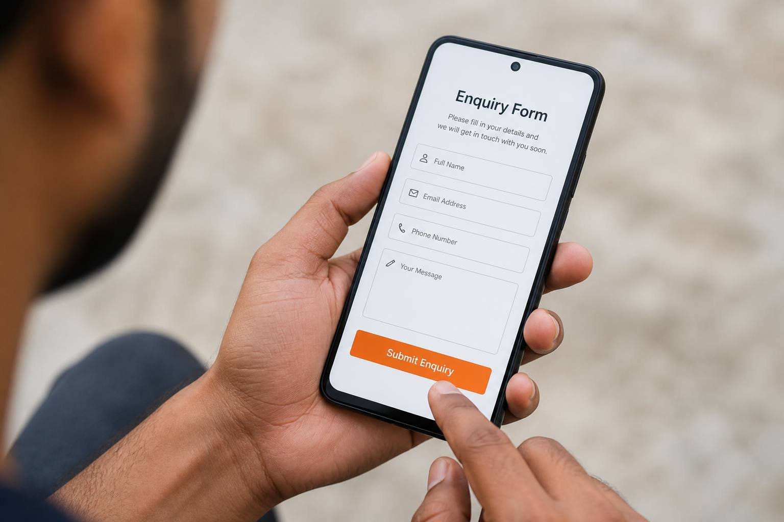
Every extra field loses someone. Nielsen Norman Group’s web form guidelines make the same point. Collect the rest on the sales call. Show a human response time. Use click-to-call for mobile users who hate typing.
5. Speed is a conversion feature
A slow page feels careless. Google’s Core Web Vitals are a practical speed checklist. Compress images, avoid heavy sliders, and test on a mid-range phone. Speed also helps SEO.
6. Make the next step one thing
Choose WhatsApp, call, or form as the primary action. Secondary links can exist. They should not compete at the same visual weight.
- Write buttons as actions: Get a quote, Book a call.
- Repeat the contact path in the header, page, and footer.
- Remove auto-playing video that delays the offer.
- Check the thank-you message actually sets expectations.
7. Follow up like a professional
The conversion is not the form submit. It is the reply. Use email marketing for a simple confirmation and a useful next mail. Silence after an enquiry trains people to try someone else.
The best conversion change is usually the one that removes confusion, not the one that adds urgency.
8–10. Offer, mobile, and measurement
Publish a starting point for price or process — our 2026 India website cost guide is one example — so serious buyers can self-qualify. Design thumb-friendly menus. Measure enquiries and booked calls, not only sessions.
What to test in the next fourteen days
Day one to three: rewrite the first screen and the button label. Day four to seven: shorten the form and add a response-time line. Day eight to fourteen: compress images and remove one popup. Compare enquiry rate, not bounce rate alone.
Do not change everything at once. You will not know what helped. Write the hypothesis: “Fewer fields will increase completed quotes.” Then look at the numbers with the same traffic source.
If paid traffic is expensive, fix the landing page before you raise the budget. If organic traffic is strong and sales are not, read our notes on UX mistakes and repair the journey.
Sales and site have to agree
If the website promises a 48-hour reply and sales replies in a week, conversion data will look mysterious. Align the promise with the calendar.
Record the source of each enquiry: Google, Instagram, referral. You cannot improve what you dump into one inbox pile.
Once a month, sit with a salesperson and click the site together. The phrases they use on calls should appear on the page.
Create a simple scoreboard: visits to the money page, form starts, form completes, booked calls. Share it with whoever owns ads. Conversion is a team sport.
When a test wins, document it. Redesigns often wipe a high-performing button label because nobody wrote it down.
Offer pages that sell without shouting
Explain who the service is for, what you need from the client, typical timeline, and how billing works. Mystery creates extra calls that should have been enquiries. Clarity creates better-fit leads.
Place a short FAQ under the form: Do you work outside Tiruchengode? Can we start with a small page set? Honest answers reduce fear more than countdown timers.
Run the same tests on paid and organic landing pages. A page that converts search traffic may still fail ad traffic because the visitor has less context. Write a first line that repeats the ad promise.
Create a two-week calendar: one change, one measure, one note in a shared doc. Conversion improves from that habit, not from a midnight redesign.
If you want these tests run on your site, contact Nicco Web Solutions. We will prioritise the leaks that affect revenue first.
0 Comments
Leave a Comment



+91 8903020729
Mon - Sun
9.30 am - 7.30pm
457/1-1, Nadar street-10,
Sanarpalayam, Tiruchengode,
Tamil Nadu 637211
Sanarpalayam, Tiruchengode,
Tamil Nadu 637211